Although I am not a Graphic Designer, I do have something of a passing interest in the field. Lately that interest has developed into a mild obsession with the endless variety — and thematic commonalities — of pizza box design.
In my grand plan to make this blog even more unfocused, I will be adding my — well, critique is probably too strong a word — analysis of the world of pizza box design.
Exhibit A:
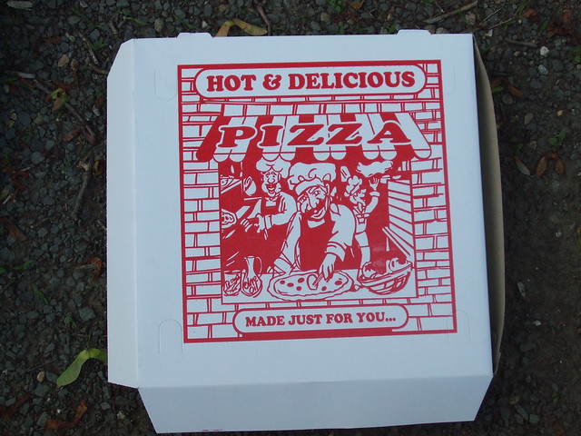
This comforting specimen was picked up in New York and unfortunately contained what I would describe as “Massachusetts Pizza.” Massachusetts Pizza is basically bread and cheese — thick, doughy, and lacking in the crustiness of a NY slice. An epicurian bummer.
Nevertheless, this is prime example of traditional pizza box design. It’s a capsule of days gone by — days when pizza places had arcade-style racing games, when designs were printed in one ink color, and when it was ok to have mildly racist cartoon depictions of Italian people on promotional materials.
Of course, it also has THE classic element of old school pizza box design: a generic product claim. In this case it’s “Hot & Delicious Pizza…MADE JUST FOR YOU.” Although the two cartoon gents in the back seem pretty jolly, the sinister look on the center cook’s face combined with the mysterious ellipsis (…) make the tagline seem somewhat…threatening. What could possibly follow the …? “MADE JUST FOR YOU…THE BASTARD WHO HAS BEEN SLEEPING WITH MY WIFE”?
On the other hand, the presence of a jovial little carafe adorably labeled “Olive Oil” in the bottom left makes it pretty unlikely that anything nefarious is happening — other than the usual exploitation of ethnic minorities for marketing purposes.
Rating: Win. There’s a lot to look at and it reminds me favorably of good pizza. Fail because the pizza wasn’t that good. Win for marketing!
Exhibit B:

With a salute to what I’m assuming is a 60’s minimalist design aesthetic, this swingin’ box keeps it simple and bold with lots of geometry. A weirdly-proportioned wheat plant in front of trapezoid provides additional visual interest on the left side.
Rating: Win. I’m guessing this is something a design firm in the 80’s came up with to “modernize” the old Luigi/Mario pizza boxes of yore. And now, 30 years later, it’s taking its place among all the outdated designs it was designed to replace. There’s something poetic in that.
