 Box #1 was collected on the trek home from our family vacation in Cape Cod.
Visual Assessment There’s the presence of pizza box red ink, and the promise of “Italian Family Dining,” but the place is called “The Chateau”? I’m a little confused.
Generic Product Claim: The old stand-by: “Fresh Hot Pizza.”
Rating: Weird but memorable.
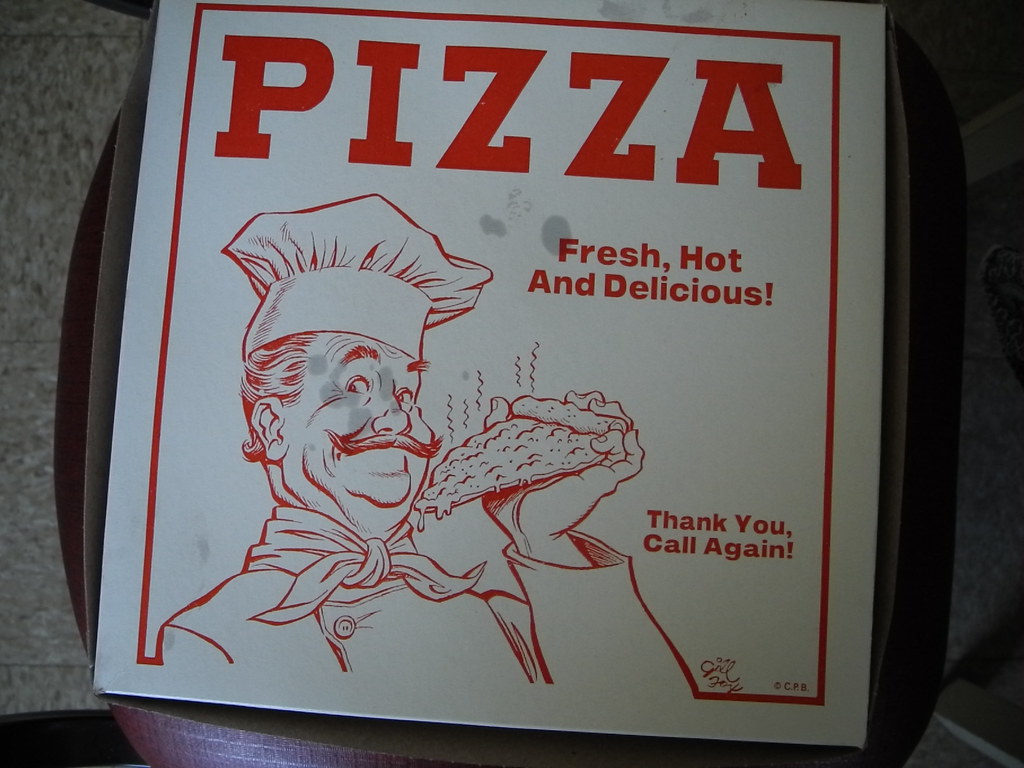
Box #2 was found abandoned in a community fridge. I usually stick with boxes from pizza that I personally purchased, but in this case the box was too good to resist.
Visual Assessment: Classicism on steroids. Classic red ink, an Italian Stereotype with a healthy ‘stache and eyebrows, and a nicely rendered slice complete with bubbly cheese.
Generic Product Claim: “Fresh, Hot And Delicious” (with punctuation). Also, PIZZA.
Rating: Probably one of my favorite chef-focused design. Love that neckerchief!

haha nice
Also, “Call again!” is a bit… forward. Desperate, even.
Awww… it is, isn’t it?