Well, I knew TAOPBGD would come full circle eventually. These two recently acquired boxes have designs we’ve seen before. What can we learn by giving them a studied second look?
Rerun #1:
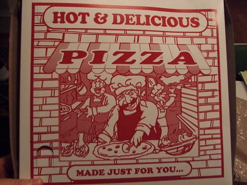
I first reviewed this Hot & Delicious design all the way back in the very first TAOPBGD post, and I still feel like that center chef is giving me the stink-eye. Side note: Do you think they depict pizzas as being in brick buildings to make you think of brick ovens, and therefore deliciousness? Or is it just a nostalgia inducing thing?
Rerun #2:

Fresh Dough Daily Part II. The first time I saw this design, it was on brown cardboard and the pizza in it was somewhat similar in taste and texture. This time, it had a white background and the pizza was pretty spectacular. Guess you can’t judge a pizza by its box.

Yeah, there is something hugely sinister about pretty much everything that’s going on in #1. It is definitely a meth lab.